Agency FAQ
Can I migrate Media and/or Jobs data from OLD system to NEOSYS?
As you already might have a management system in place for Media and/or Jobs or are doing the same word in Excel or Word, we are not going to look into migrating this information to NEOSYS as this information is outdated and will not make sense putting into a new specialized system like NEOSYS. We will allow this type of information to be stored separately in their existing structure for future reference and put all new information into NEOSYS (eg new media plans, schedules, jobs, estimates etc). i.e. if you decide to start off with NEOSYS on 1st of May, 2009; then you will do no more work in your old way and enter all new information into NEOSYS.
What are alias codes in NEOSYS?
Client and Brand, Supplier, Market, Currency, Media/Job Type and Vehicle Files have a field to enter "alias" codes which can be used to cross reference the same records in other external systems particularly when importing and exporting data.
How do I remove executives that are no longer present or required in NEOSYS?
Inactive executives or duplicate names for an executive can be removed from the list of executives using the Edit button in the Schedule/job file. Add a reason for being stopped and save the executives file. All the executives saved with a reason in Stopped field will not appear in the list of Executives. You can reactivate an executive i.e make it re appear in the list by removing the Stopped reason from the file for that executive as shown in the screenshot below.
Can I resize images to use in letterhead for NEOSYS documents?
Why cant you resize a nice large graphic of text down to the size required?
All jpg/gif/png files lose quality if you resize them. The problem shows up most clearly in graphics of text because of all the fine lines in the characters. Some corporate logo files suffer less from the problem if they have a simple design, but very few are immune from the problem.
Since it is impossible to simply resize an existing file without losing quality, the only way to get the correctly sized graphic is to have it regenerated from the master image - typically stored in a Photoshop or other image designer file.
There is no escape from this rule. Nobody and no program can simply resize an existing jpg/gif/png file and retain quality. Resizing only slightly is, if anything, even worse than resizing significantly.
Since resizing graphics of text is not a simple matter, generally any text in headings is done in HTML text. Using image files for text is a last resort used only if the required font is unusual as is sometimes the case for non-western scripts.
Why bother with getting the best quality?
NEOSYS clients are in the advertising business so generally they need to show that they can manage their own graphics. The more skilled eyes in the advertising and marketing departments of both NEOSYS clients and their clients will notice poor quality even if the untrained eye does not.
NEOSYS support staff must request properly generated files and refuse to resize larger images down to size or accept poor quality resized files from client staff. The quality of the clients documents reflects on everybody including NEOSYS and client management will expect NEOSYS support to ensure that the best quality work is done and overcome any internal obstacles.
Images that appear to be low but acceptable quality on-screen may be much less acceptable quality when printed therefore before accepting poor quality images, make sure you check actually printouts on paper.
What is the problem technically?
The problem arises because jpg/gif/png graphic files are just a pattern of dots and the original graphic design program has generated some dots with shading to create an illusion of smooth strokes despite the fact that a smooth curves and diagonals cannot be represented exactly on a grid of dots. When you resize the graphic (pattern of dots) the resizing program has no idea of where the strokes of the letters are and it is totally unable to recreate, on a different grid of dots, a new set of half-shaded dots that creates the same illusion of smoothness.
Example of Graphic correctly GENERATED to the desired size
This image is too rather too big for our letter head because it is 200 pixels high. So we need to resize it? Well no, we need to REGENERATE it from the master logo design file. See next image below.
Here is an alternative version of the above text generated to a much smaller size. As long as the graphic is regenerated from the master design and not resized, it is possible to have text quite small in graphics but still to have good quality of appearance.
Example of Graphic crudely RESIZED to the desired size
LETS LOOK AT A GRAPHIC THAT HAS BEEN CRUDELY RESIZED
Here is an image that has been resized smaller from a large and lovely jpg file originally produced from Photoshop.
It looks kind of ok to the untrained eye at 100%, but not if you had a decent quality image to compare it with, and when printed on paper, the low quality becomes much more apparent.
Take a closer look -150% - not very smooth is it?
at 200% we clearly see that the image could be much better. The letters are lumpy and the bottoms of all the letters are clearly cut off on the 4th line. These problem are typical of what happens when you "resize" a nice large graphic down to the size you want.
lets go even closer 400% ... here we can see all kinds of grey mess even between the letters.
Closer look at the correct GENERATED image
Now lets look at the graphic that has been properly generated to the exact size desired ... from the original master design in Photoshop.
It has a crisp and clean look about it.
Zooming in to 200% we see that that the dots are cleverly shaded to create the illusion of smoothness. The image is blurred now that we are viewing it at 200% but that is expected.
at 400% the nature of shading to create illusion of smoothness is clear. It also become clearer that the shading has been generated for a specific grid of dots and resizing could not be done without reference to the original knowledge of strokes and letters to generate a new pattern of shading.
Another example of a CORRECTLY GENERATED logo/image file
This SMALL image file (only 72 pixels high) has been created properly by a programmer from the master design file (eg photoshop) designed by a professional graphic artist.
In this case it is a jpg file but png would be the same. You can see this file at http://vm1.neosys.com/images/neosys.jpg
Despite only 72 pixels vertically this file doesnt look pixelated either on screen or when printed.
Look at it zoomed in so you can look at the quality more closely.
Even at this magnification, there is still little or no pixelation visible. This is because the dots are clever dithered to give the IMPRESSION of smoothness.
Moral of the story is that properly created image files do not appear pixelated whereas crudely resized images lose the clever dithering and show as pixelated
How do I classify clients based on industry or parent company?
Client Group fields present in the Client and Brand file are used to classify clients according to industry, organisation size and/or parent company etc. You can classify clients using Client Group 1 or Client Group 2 or both or neither.
Classifying clients using client groups is not compulsory. However, doing so, allows you to take various reports using industry-wise, or parent company wise filters.
Example:
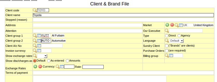
Toyota is a subsidiary of Al Futtaim that belongs to the Automotive industry. So in the Client and Brand File of Toyota, you can classify it as a member of Al Futtaim using Client Group 1 field and/or classify it as a member of Automotive group using the Client Group 2 field. It does not matter whether you classify Al Futtaim as Client Group 1 or Client Group 2 - same is the case for Automotive.
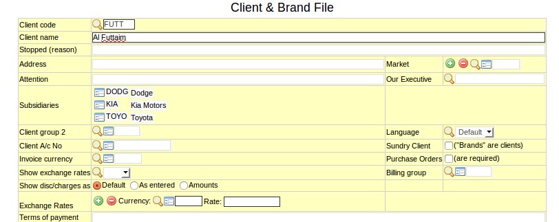
In the Client and Brand File of Al Futtaim, you can see Toyota as a subsidiary.
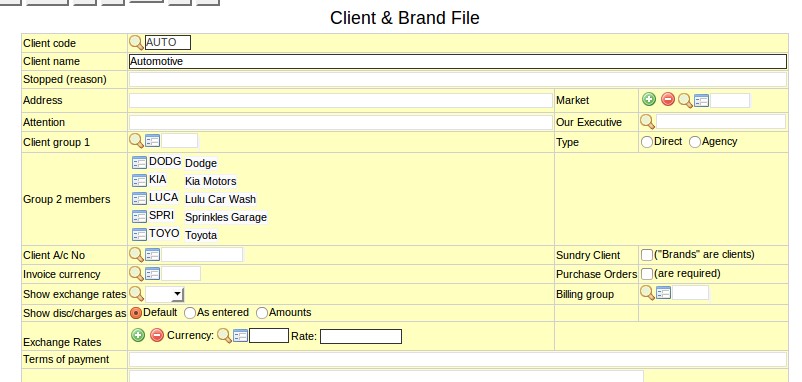
In the "fake" Client and Brand File called Automotive, you can see Toyota as one of the Group 2 members.
How to classify suppliers into groups?
If you have many suppliers that are part of a single "supplier group", then you can group these suppliers together. By doing so, you can generate reports for the whole supplier group.
Example:
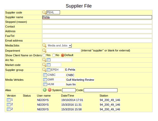
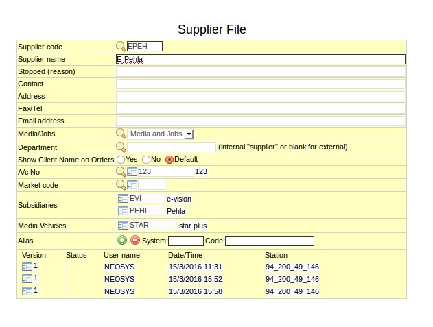
Pehla and E-vision are both suppliers of a large group call E-Pehla.
In the Supplier file of Pehla, you should enter E-Pehla as the Supplier Group. Same should be done for E-vision.
Pehla and E-vision will show as subsidiaries in the Supplier File of E-Pehla.
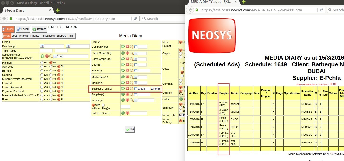
When taking reports, if E-Pehla is entered in the Supplier Group filter, information pertaining to ALL the suppliers in E-pehla group will be shown in the report:
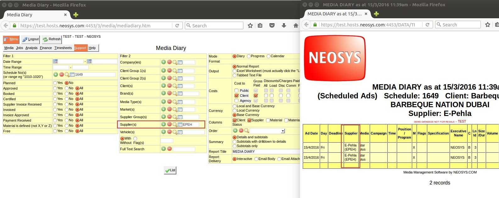
If E-Pehla is entered in the Supplier filter, informaton pertaining directly to E-Pehla only will be shown:
Why are text columns on printouts or pdfs very narrow taking up a lot of vertical space?
The problem:
This usually happens on printouts or on conversion to pdf. NEOSYS reports with many columns can appear quite squeezed in portrait mode using the default font and settings.
The cause:
- NEOSYS creates documents and reports in a format that is not biased to any one display or print size since what is suitable for one user is not suitable for another.
- NEOSYS does not attempt to predict the best column widths since the nicest column widths completely depend on the amount of text in any one column entered in practice.
- NEOSYS leaves the selection of column widths to the browser to auto-fit columns as best it can. This produces far better results in the vast majority of cases than could be achieved by choosing fixed column widths, but often could be better.
The solution:
If the browser defaults are not satisfactory, you can fine tune the exact configuration before printing or converting to pdf as follows:
- Choose a smaller font in your browser before printing/converting. This is easily done by doing "Alt+V, Text Size, Smaller/Larger" for Internet Explorer, "Alt+E, Preferences, Content, Fonts and colors" for Firefox, "Alt+E, Settings, Web content, Font size" for Chrome.
- Reduce the left and right margins
- Use landscape format
What is the difference between terms of payment and payment instructions?
The terms on which the supplier and client agree to make the payment for an invoice is mentioned in terms of payment, e.g. 60 days from the date of invoice.
Details entered in payment instruction consist of bank account and other transactional details required for payment transaction e.g. Bank account details, SWIFT code, bank charges etc.
Terms of payment and payment instruction if setup appear in the invoice.
Also refer to Configuring payment instructions and Specifying term of payment on Invoices


