Agency FAQ: Difference between revisions
→Why are text columns on printouts or pdfs very narrow taking up a lot of vertical space?: Remove mention of internet explorer (obsolete) |
|||
| (7 intermediate revisions by 4 users not shown) | |||
| Line 13: | Line 13: | ||
[[image:Executive.jpg]] | [[image:Executive.jpg]] | ||
== | == How is Client Address on invoices obtained? == | ||
Client & Brand files are created in the Media/Jobs module and their respective Client A/c Nos are created in Finance module and assigned to the Client & Brand files. | |||
The Client & Brand file is often created first, to record information about the client, whereas Client A/c No often gets assigned afterwards. | |||
The client address on invoices is obtained following these steps: | |||
#If agency configuration file is set to use account name and address instead of client file details, | |||
#*In the client and brand file for the brand used, check if a/c no. is present in the brand line. If true and if the a/c no's address file has a recorded address, then use that. | |||
#*Else check if client a/c no. is present in the client and brand file. If true and if the a/c no's address file has a recorded address, then use that. | |||
#*Else use the address details found in the client and brand file | |||
#Else use the address details found in the client and brand file | |||
Configuration: [[Media_Configuration_File#Invoice_uses_account_name_and_address_instead_of_client_file_details| Invoice uses A/c No & Address instead of client file details]] | |||
[[ | |||
==How do I classify clients based on industry or parent company?== | ==How do I classify clients based on industry or parent company?== | ||
| Line 152: | Line 77: | ||
[[File:s_mediadiary.jpg|1500px]] | [[File:s_mediadiary.jpg|1500px]] | ||
== Why are text columns on printouts or pdfs very narrow taking up a lot of vertical space? == | |||
The problem: | |||
This usually happens on printouts or on conversion to pdf. NEOSYS reports with many columns can appear quite squeezed in portrait mode using the default font and settings. | |||
The cause: | |||
*NEOSYS creates documents and reports in a format that is not biased to any one display or print size since what is suitable for one user is not suitable for another. | |||
*NEOSYS does not attempt to predict the best column widths since the nicest column widths completely depend on the amount of text in any one column entered in practice. | |||
*NEOSYS leaves the selection of column widths to the browser to auto-fit columns as best it can. This produces far better results in the vast majority of cases than could be achieved by choosing fixed column widths, but often could be better. | |||
The solution: | |||
If the browser defaults are not satisfactory, you can fine tune the exact configuration before printing or converting to pdf as follows: | |||
*Choose a smaller font in your browser before printing/converting. To do this, open browser settings and search for "font" | |||
*Reduce the left and right margins | |||
*Use landscape format | |||
==What is the difference between terms of payment and payment instructions? == | |||
The terms on which the supplier and client agree to make the payment for an invoice is mentioned in terms of payment, e.g. 60 days from the date of invoice. | |||
Details entered in payment instruction consist of bank account and other transactional details required for payment transaction e.g. Bank account details, SWIFT code, bank charges etc. | |||
[[Client_%26_Brand_File#Terms_of_Payment|Terms of payment]] and [[Client_%26_Brand_File#Payment_Instructions|payment instruction]] if setup appear in the invoice. | |||
Also refer to [[Setting_up_and_Configuring_NEOSYS_Generally#Configuring_Payment_Instructions| Configuring payment instructions]] and [[Setting_up_and_Configuring_NEOSYS_Generally#Specifying_Payment_Terms_on_Invoices| Specifying term of payment on Invoices ]] | |||
Latest revision as of 13:48, 16 May 2025
Can I migrate Media and/or Jobs data from OLD system to NEOSYS?
As you already might have a management system in place for Media and/or Jobs or are doing the same word in Excel or Word, we are not going to look into migrating this information to NEOSYS as this information is outdated and will not make sense putting into a new specialized system like NEOSYS. We will allow this type of information to be stored separately in their existing structure for future reference and put all new information into NEOSYS (eg new media plans, schedules, jobs, estimates etc). i.e. if you decide to start off with NEOSYS on 1st of May, 2009; then you will do no more work in your old way and enter all new information into NEOSYS.
What are alias codes in NEOSYS?
Client and Brand, Supplier, Market, Currency, Media/Job Type and Vehicle Files have a field to enter "alias" codes which can be used to cross reference the same records in other external systems particularly when importing and exporting data.
How do I remove executives that are no longer present or required in NEOSYS?
Inactive executives or duplicate names for an executive can be removed from the list of executives using the Edit button in the Schedule/job file. Add a reason for being stopped and save the executives file. All the executives saved with a reason in Stopped field will not appear in the list of Executives. You can reactivate an executive i.e make it re appear in the list by removing the Stopped reason from the file for that executive as shown in the screenshot below.
How is Client Address on invoices obtained?
Client & Brand files are created in the Media/Jobs module and their respective Client A/c Nos are created in Finance module and assigned to the Client & Brand files.
The Client & Brand file is often created first, to record information about the client, whereas Client A/c No often gets assigned afterwards.
The client address on invoices is obtained following these steps:
- If agency configuration file is set to use account name and address instead of client file details,
- In the client and brand file for the brand used, check if a/c no. is present in the brand line. If true and if the a/c no's address file has a recorded address, then use that.
- Else check if client a/c no. is present in the client and brand file. If true and if the a/c no's address file has a recorded address, then use that.
- Else use the address details found in the client and brand file
- Else use the address details found in the client and brand file
Configuration: Invoice uses A/c No & Address instead of client file details
How do I classify clients based on industry or parent company?
Client Group fields present in the Client and Brand file are used to classify clients according to industry, organisation size and/or parent company etc. You can classify clients using Client Group 1 or Client Group 2 or both or neither.
Classifying clients using client groups is not compulsory. However, doing so, allows you to take various reports using industry-wise, or parent company wise filters.
Example:
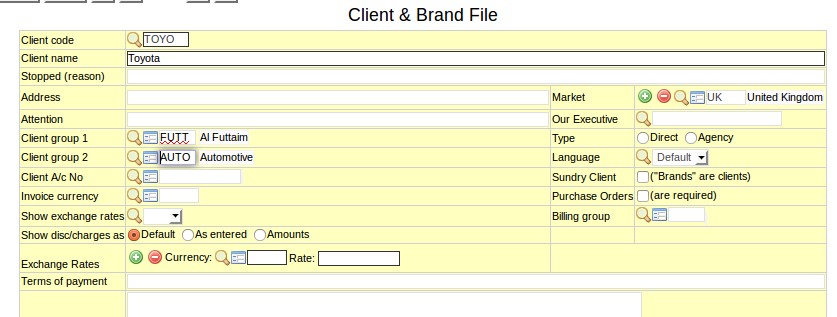
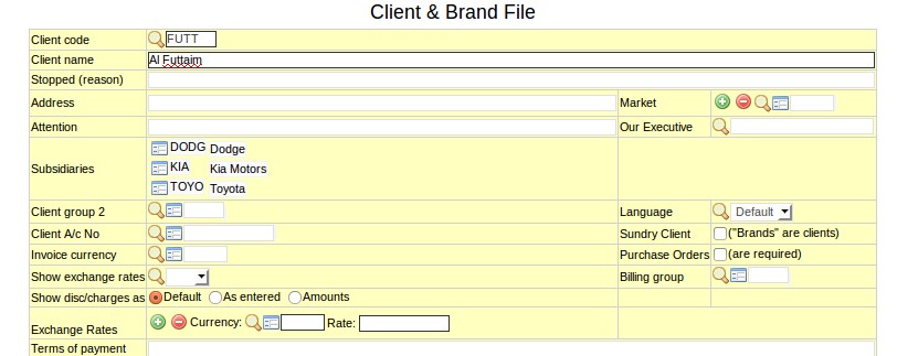
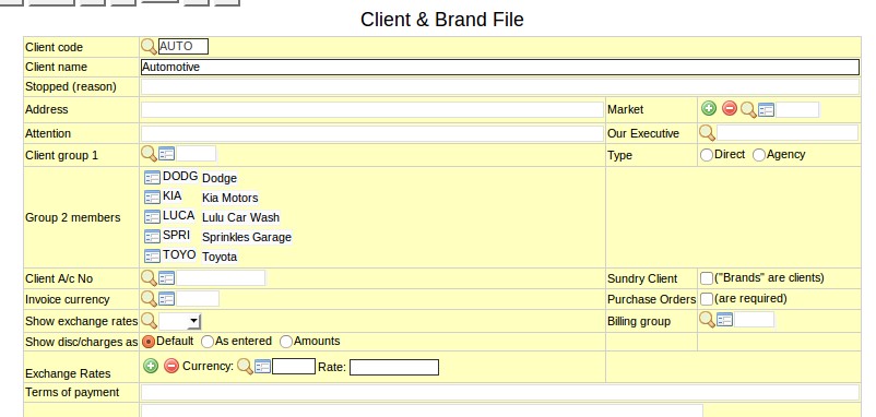
Toyota is a subsidiary of Al Futtaim that belongs to the Automotive industry. So in the Client and Brand File of Toyota, you can classify it as a member of Al Futtaim using Client Group 1 field and/or classify it as a member of Automotive group using the Client Group 2 field. It does not matter whether you classify Al Futtaim as Client Group 1 or Client Group 2 - same is the case for Automotive.
In the Client and Brand File of Al Futtaim, you can see Toyota as a subsidiary.
In the "fake" Client and Brand File called Automotive, you can see Toyota as one of the Group 2 members.
How to classify suppliers into groups?
If you have many suppliers that are part of a single "supplier group", then you can group these suppliers together. By doing so, you can generate reports for the whole supplier group.
Example:
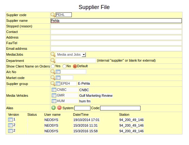
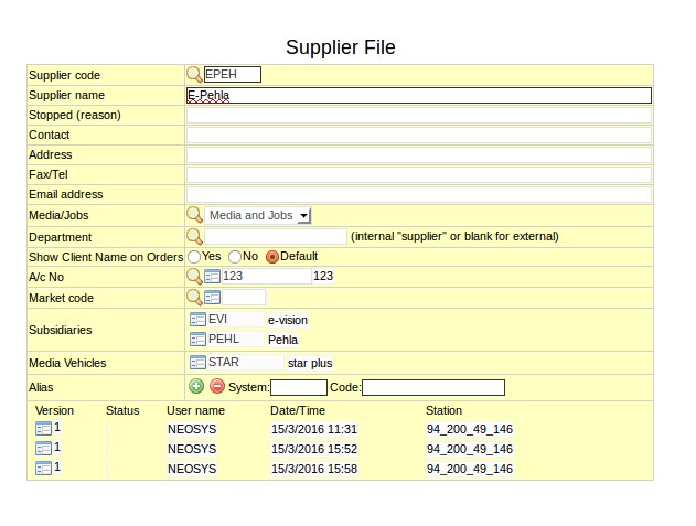
Pehla and E-vision are both suppliers of a large group call E-Pehla.
In the Supplier file of Pehla, you should enter E-Pehla as the Supplier Group. Same should be done for E-vision.
Pehla and E-vision will show as subsidiaries in the Supplier File of E-Pehla.
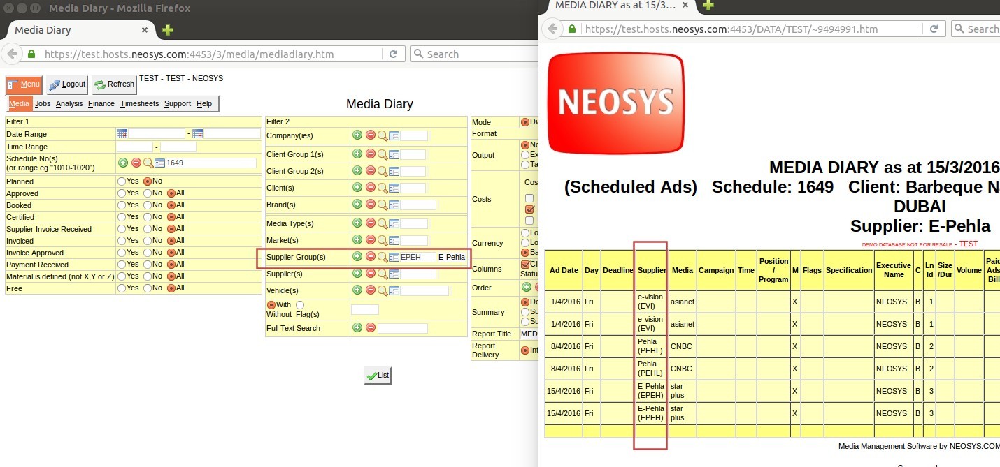
When taking reports, if E-Pehla is entered in the Supplier Group filter, information pertaining to ALL the suppliers in E-pehla group will be shown in the report:
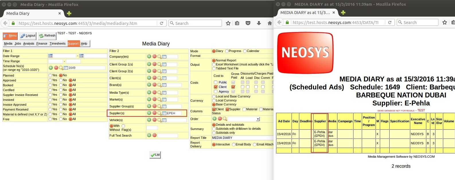
If E-Pehla is entered in the Supplier filter, informaton pertaining directly to E-Pehla only will be shown:
Why are text columns on printouts or pdfs very narrow taking up a lot of vertical space?
The problem:
This usually happens on printouts or on conversion to pdf. NEOSYS reports with many columns can appear quite squeezed in portrait mode using the default font and settings.
The cause:
- NEOSYS creates documents and reports in a format that is not biased to any one display or print size since what is suitable for one user is not suitable for another.
- NEOSYS does not attempt to predict the best column widths since the nicest column widths completely depend on the amount of text in any one column entered in practice.
- NEOSYS leaves the selection of column widths to the browser to auto-fit columns as best it can. This produces far better results in the vast majority of cases than could be achieved by choosing fixed column widths, but often could be better.
The solution:
If the browser defaults are not satisfactory, you can fine tune the exact configuration before printing or converting to pdf as follows:
- Choose a smaller font in your browser before printing/converting. To do this, open browser settings and search for "font"
- Reduce the left and right margins
- Use landscape format
What is the difference between terms of payment and payment instructions?
The terms on which the supplier and client agree to make the payment for an invoice is mentioned in terms of payment, e.g. 60 days from the date of invoice.
Details entered in payment instruction consist of bank account and other transactional details required for payment transaction e.g. Bank account details, SWIFT code, bank charges etc.
Terms of payment and payment instruction if setup appear in the invoice.
Also refer to Configuring payment instructions and Specifying term of payment on Invoices

